Check out our blog!Click here
"A new identity means more than just a new logo and a new website."
Decom, the cheerful specialist in the field of technology recruitment, was in need of a new branding and website. They consequently put together a team incorporating designers from Vruchtvlees and developers from Elephant. The new look was intended to express the expertise as well as the sociability of Decom. This was “a real dream team” according to Decom managing director Daan van Mosseveld.
Decom wanted a corporate style that was more in keeping with their character and their ambitions. “For example, take our colour palette, borrowed from Le Corbusier,” says Daan. “The blue suits our specialisation, the yellow stands for our cheerful character, and the orange and beige express our humanity and sociability.”
Vruchtvlees designer Rindor Golverdingen adds, “A new identity means more than just a new logo and a new website. We aim to define the sentiment, the ambitions and the people behind a brand. This is ultimately expressed through a broad range of products, calling for a team of creative people who can set the same tone in components such as text and photography.”
"A new identity means more than just a new logo and a new website."
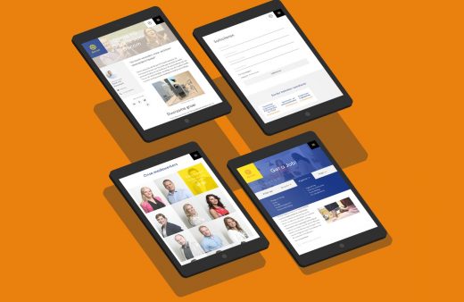
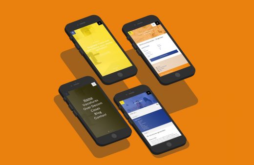
A new site was also needed from a technical perspective. Daan explains, “A new applicant tracking system (ATS) was also needed for the efficient management of job vacancies and job applications.” Furthermore, the site had to be designed to enable easy access via smartphones and tablets. “That is very important in this day and age,” says Micha Ligtvoet, project manager at Elephant.
In order to ensure that the best people worked on this project, Decom selected two parties: a creative party and a technical party. Daan explains, “They did not know each other initially so we linked them together. They may have needed some time to get used to this, but I believe the resulting tension had a positive effect. We wanted to challenge everyone to go to the limits, and we think that through this we managed to achieve the optimum result. “
In order to clarify to all parties what Decom stands for, Vruchtvlees organised creative sessions in which the strategy was determined. According to Rindor, this strategy was in keeping with Decom’s long-term ambitions. “In Decom we primarily observed professionalism, innovation, a personal approach and a touch of southern Netherlands sociability.”
Once Decom’s new look had been established, Elephant joined in with the sessions. Micha says, “These were good sessions, on the basis of which we developed characterisations of prototypical users of the website. What do they want? What are they looking for? Can they find what they want easily? This online strategy is important.”
Behind the scenes Elephant has also made improvements. Micha explains, “We have made the CMS user-friendly for Decom so they can easily build up their pages from different blocks. It has to be easy for them to create something good by themselves.”
“They are good at what they do and we had complete confidence in them.” Daan van Mosseveld, Decom
This led to a new photography style, a new tone of voice, a new website and a new corporate style. The new photographs were taken by Jordi Huisman. He has worked with Vruchtvlees in the past and was approached by them to take pictures for Decom in his characteristic informal and light-hearted style. Huisman spent a day with Decom as a fly on the wall, explaining, “The most natural photographs can be obtained by just letting people carry on as normal.”
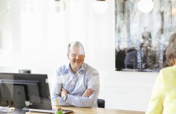
Jordi sometimes stages a photograph, as in the opening picture on the website: “I spotted a nice corner with lots of space around it, which is handy if the picture is to be overlaid with text, so I asked someone working there if he would sit in the corner and play with his telephone.”
“Decom was open to the exploration of uncharted territory and creative interventions.” Rindor Golverdingen, Vruchtvlees
The new tone of voice and the text on the website were created by Hotel Content, which has also worked previously with Vruchtvlees. Besides a new visual style, a new style of communication was required. Ko van ’t Hek from Hotel Content says, “After an intensive discussion with Decom we understood that they wanted to express both expertise and sociability. We were then given full freedom of expression, such as with the opening sentences on the website. I think we have struck the right note.”

Rindor also recognises this freedom. “Decom was open to the exploration of unchartered territory and creative interventions.” Daan believes that giving creative parties so much freedom is a logical step. “They are good at what they do and we had complete confidence in them.”
Daan is pleased with the team and with the cooperation. “We enjoyed a pleasant working relationship. They were all professional and easy to get along with. Everything ran smoothly despite the scale of the project.” However, Micha points out that it was hard work. “In some weeks I spoke to Tom Benders from Decom more often than my own wife. But in a good way.” Rindor is enthusiastic about the cooperation, too. “It feels as if we have made new friends.”
Check out our blog!Click here

